17 Earthy Elegance: Nature-Inspired Color Palettes for 2026 Bathrooms
In 2026, bathroom color palettes are taking a deep breath of fresh air. The cold grays and sterile whites of the past decade are giving way to hues plucked directly from nature: the soft green of sage leaves, the warm blush of desert clay, the weathered brown of driftwood, and the deep olive of forest moss. This is earthy elegance—a trend that brings the outside in, creating bathrooms that feel grounded, organic, and endlessly calming.
Unlike the pastel trends of previous years, these colors are muted and sophisticated, acting as a backdrop for natural textures like stone, wood, and linen. Here are 17 nature-inspired palettes that will dominate bathroom design this year.
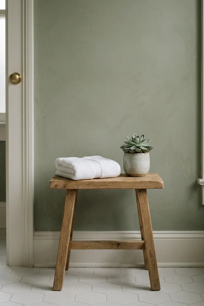
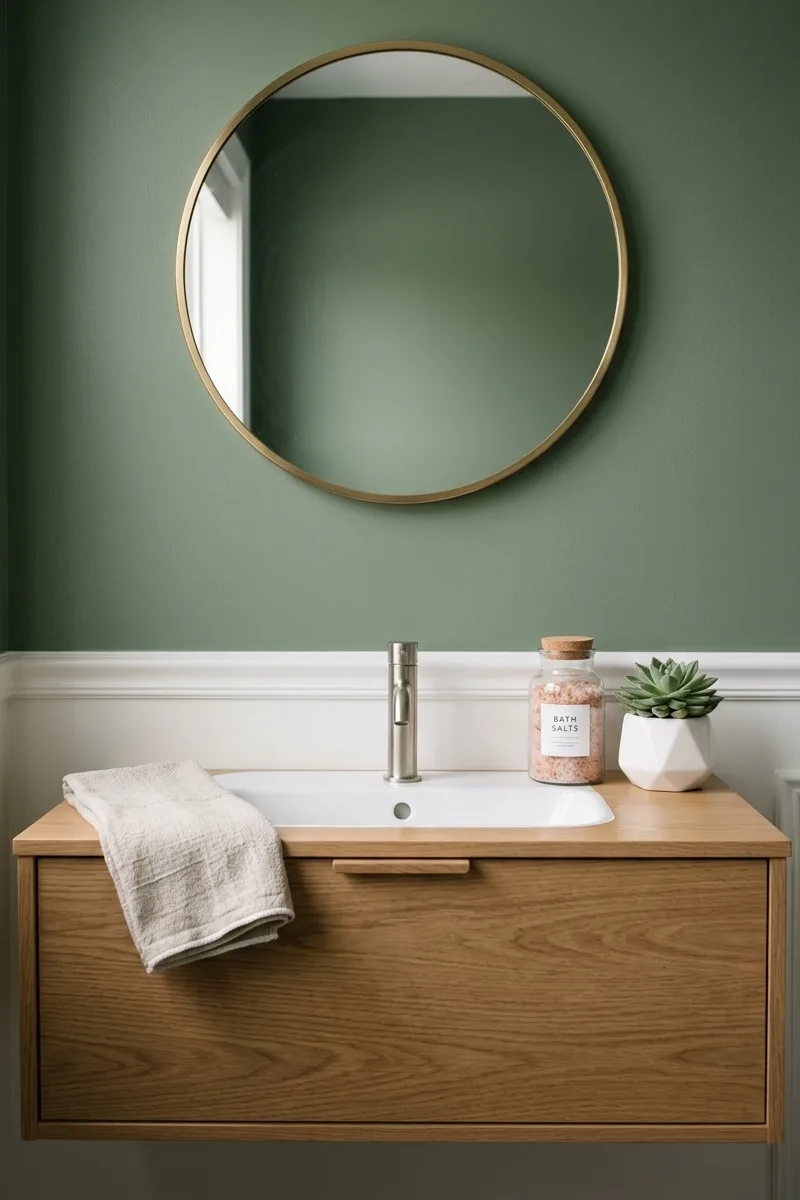
Sage green and warm white
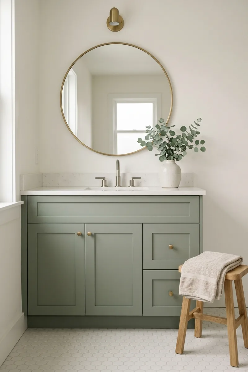
Sage green is the new neutral. This muted, gray-green evokes fresh herbs and morning gardens. Pair it with warm white (not stark white) on walls or trim. The combination feels clean but not clinical. Use sage on a vanity or as an accent wall. Add natural wood and cream textiles. It’s the most versatile earthy tone, working in modern or traditional spaces.
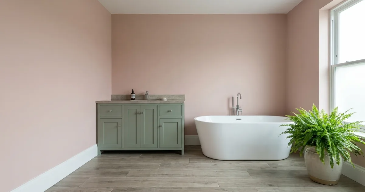
Clay pink and taupe
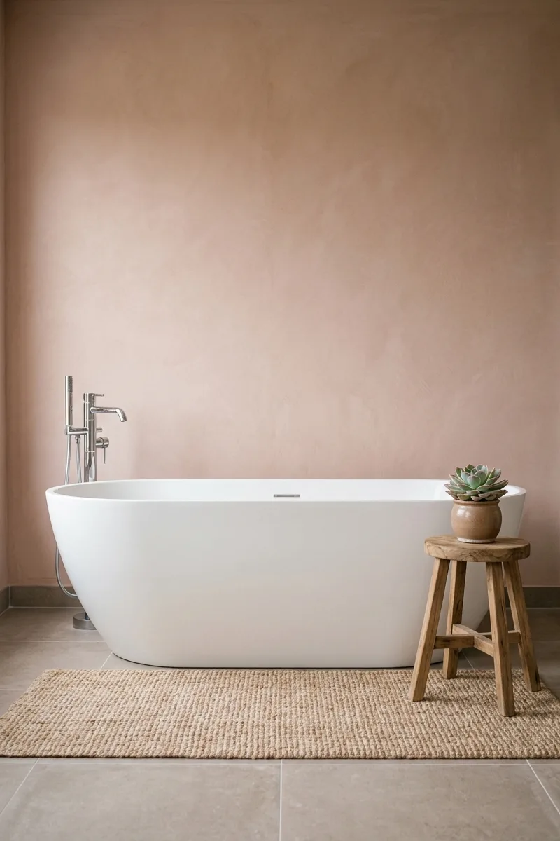
Clay pink is not your grandmother’s blush. It’s a dusty, terracotta-tinged pink that feels like sun-baked earth. Pair it with taupe, a warm gray-brown, for a soothing, grounded palette. Use clay pink on walls and taupe on floors or vanity. Add black matte fixtures for contrast. The combo feels modern, warm, and deeply relaxing.
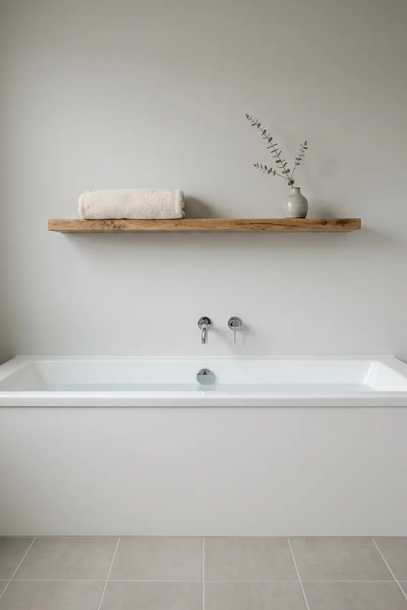
Driftwood taupe and cream
Driftwood taupe is the color of weathered beach wood. It’s a cool, gray-taupe with blue undertones. Pair it with cream—a warmer off-white—to balance the coolness. Use driftwood on a large surface like a vanity or floor tiles. Cream on walls keeps the room airy. Add woven textures like rattan or jute to reinforce the coastal driftwood feel.
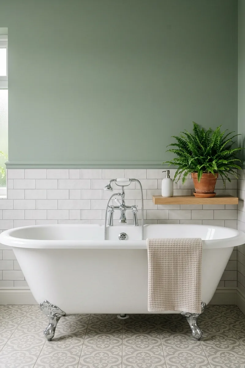
Moss green and charcoal

For a dramatic, moody palette, try moss green paired with charcoal. Moss is an earthy, olive-tinged green that feels like a forest floor. Charcoal adds depth without being black. Use moss on a single accent wall or on lower cabinets. Keep the ceiling and trim light to avoid cave-like darkness. Add brass or gold accents for warmth.
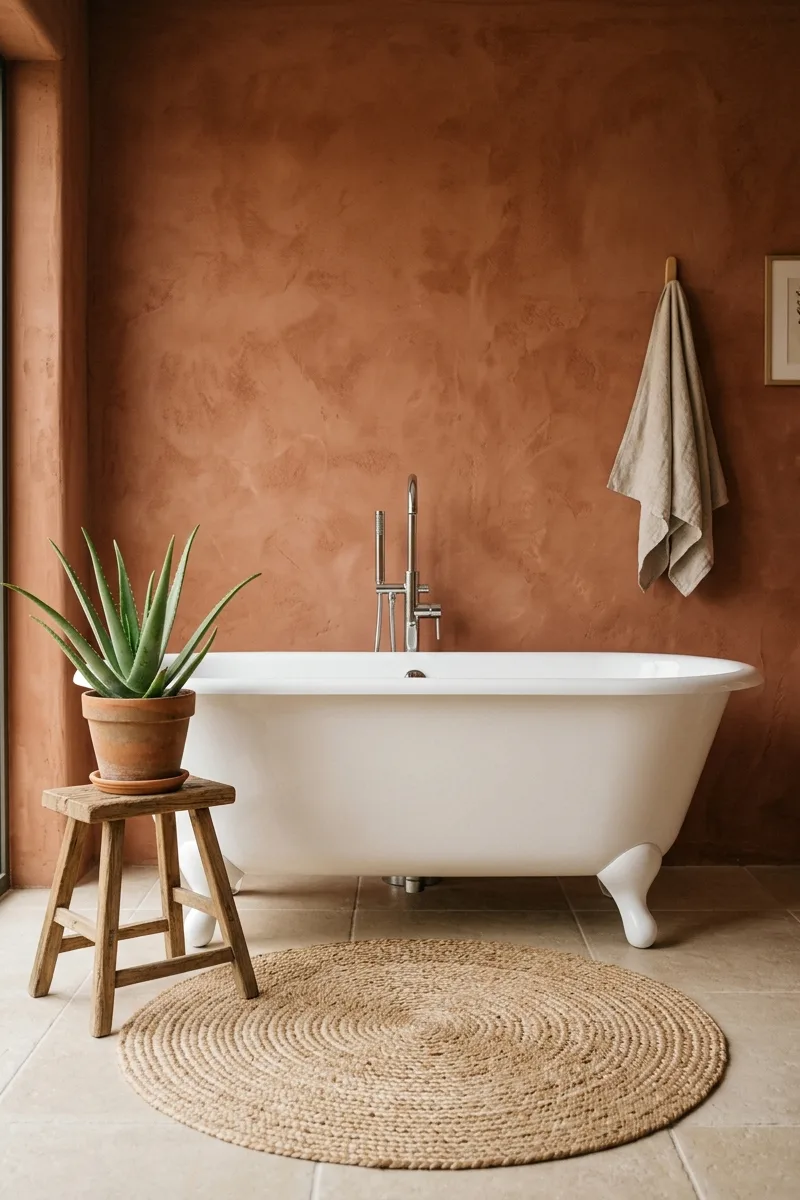
Sand dune and terracotta
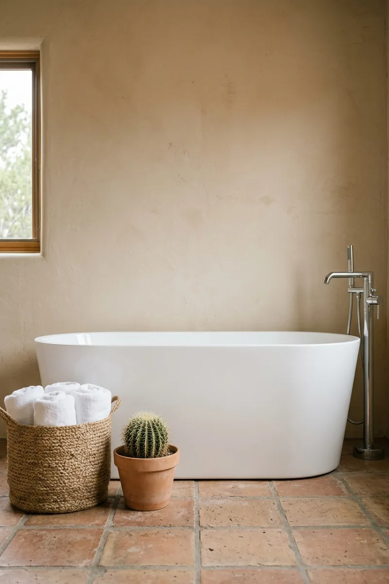
This palette evokes the desert. Sand dune is a pale, warm beige. Terracotta is a rich, orange-brown clay. Use sand on walls to create a light, expansive feel. Terracotta tiles on the floor anchor the room. Add natural linen and leather accents. The combination feels warm, arid, and deeply connected to the American Southwest.
Sea glass and driftwood
Sea glass is a pale, muted blue-green, the color of frosted beach glass. Pair it with driftwood taupe for a coastal palette that isn’t nautical. Use sea glass on a vanity or as a tile accent. Driftwood on walls or floor keeps the room grounded. Add polished concrete or white marble for a crisp, clean contrast that feels like ocean mist.
Slate blue and warm ivory
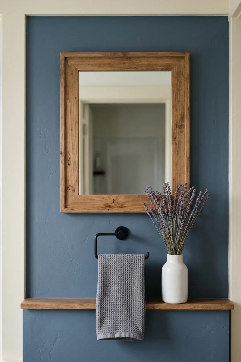
Slate blue is a muted, gray-blue like a stormy sky. It’s sophisticated and calming. Pair it with warm ivory, a creamy off-white, to avoid feeling cold. Use slate on a vanity or as a wall color. Ivory on ceilings and trim. Add polished nickel or chrome fixtures for a touch of shine. The palette feels elegant and timeless.
Bark brown and oat
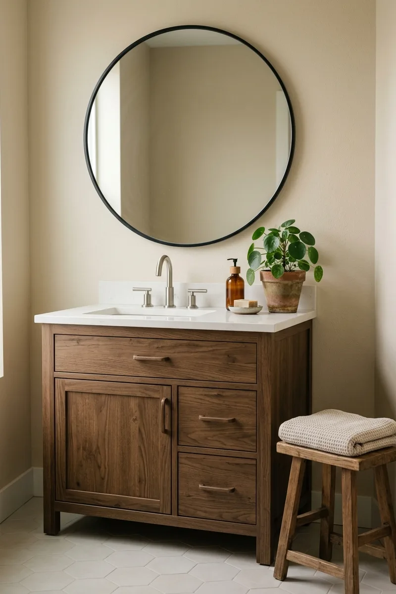
Bark brown is a rich, warm brown like tree trunk. Oat is a pale, creamy beige. Use bark on lower cabinets or as an accent wall to ground the space. Oat on upper walls and ceiling keeps the room feeling open. Add white fixtures and black hardware. The palette feels rustic, natural, and very masculine in a soothing way.
Willow green and chalk white
Willow green is a soft, yellowish green like new spring leaves. Chalk white is a matte, slightly gray white. Use willow on upper walls for a light, airy feel. Chalk white on wainscoting or trim adds crisp contrast. The palette is fresh and clean but not sterile. Add natural oak or birch wood to reinforce the springtime vibe.
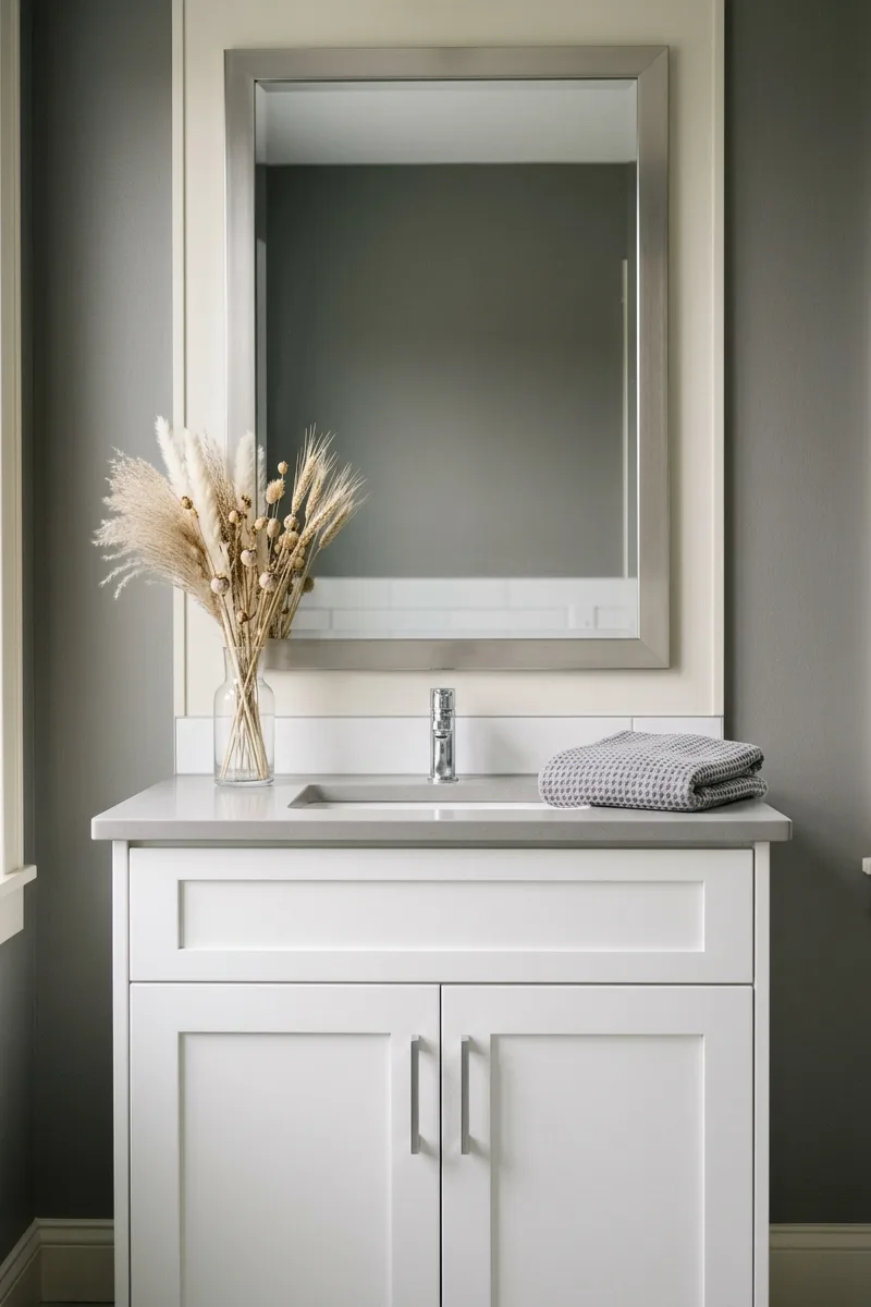
Hazelnut and fog gray
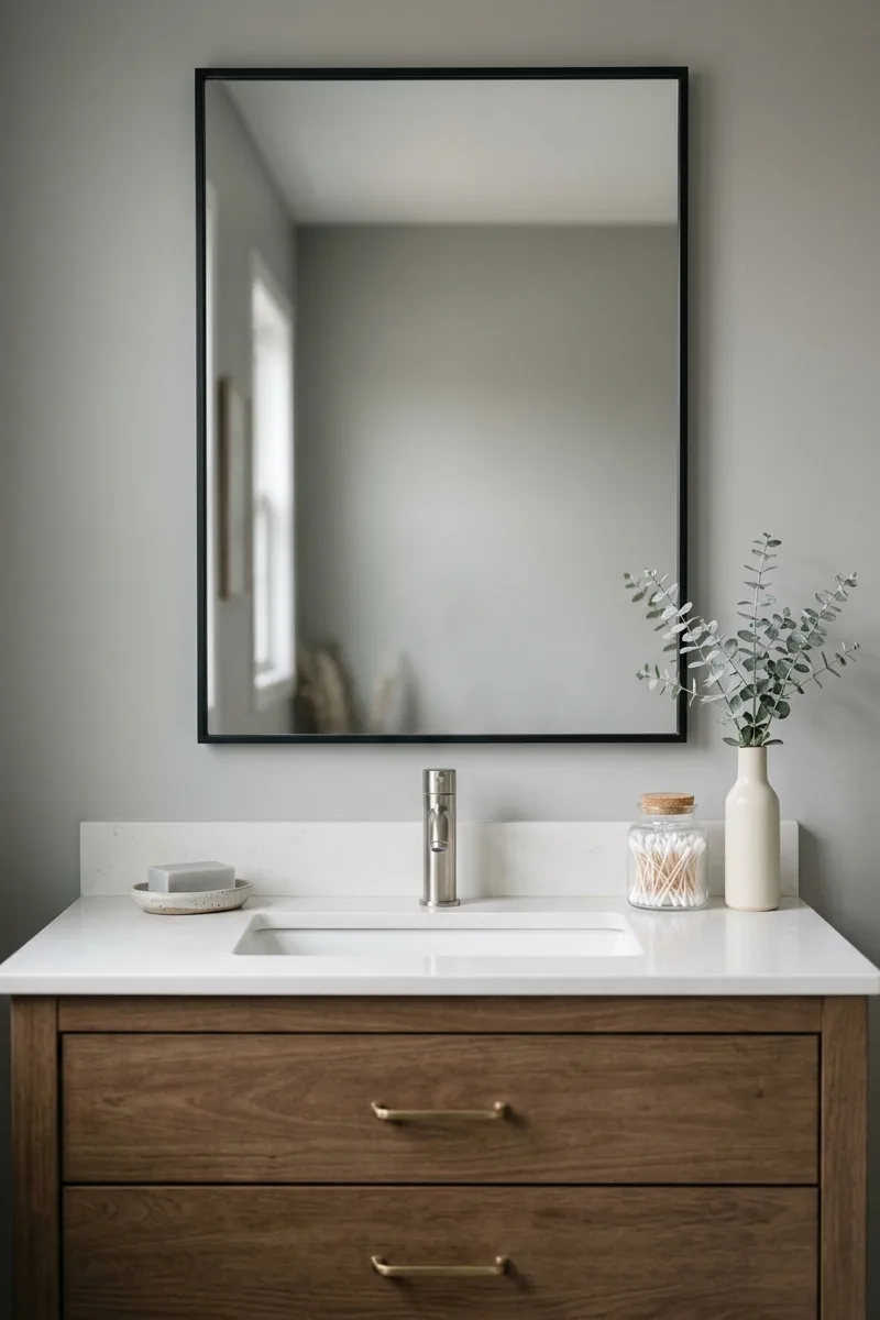
Hazelnut is a medium, warm brown like the nut’s shell. Fog gray is a light, cool gray like morning mist. Use hazelnut on a vanity or floor tiles for warmth. Fog on walls for a neutral backdrop. The combo is understated and elegant. Add matte black or brushed brass fixtures for a touch of definition. It’s a palette for true minimalists.
Thyme and linen white
Thyme is a herbaceous, slightly yellow green. Linen white is an off-white with warm undertones. Use thyme on an accent wall or a vanity to add color without boldness. Linen white on surrounding walls keeps the room bright. Add natural stone and unbleached cotton textiles. The palette is fresh, clean, and perfect for a morning routine.
Adobe and sand
Adobe is a muted, reddish-brown like sun-dried brick. Sand is a pale, warm yellow-beige. Use adobe on a single focal wall to add warmth without overwhelming. Sand on floors and remaining walls. The palette feels like a desert canyon at sunset. Add copper or brass accents for a touch of glow. It’s earthy, dramatic, and soulful.
Pewter and cream
Pewter is a soft, warm gray with brown undertones. Cream adds lightness. Use pewter on walls for a cozy, enveloping feel. Cream on ceiling and trim. Add white fixtures and light wood accents. The palette is elegant and understated, like a cloudy day in the mountains. It’s perfect for a primary bathroom that needs a serene, grown-up vibe.
Fern and ivory
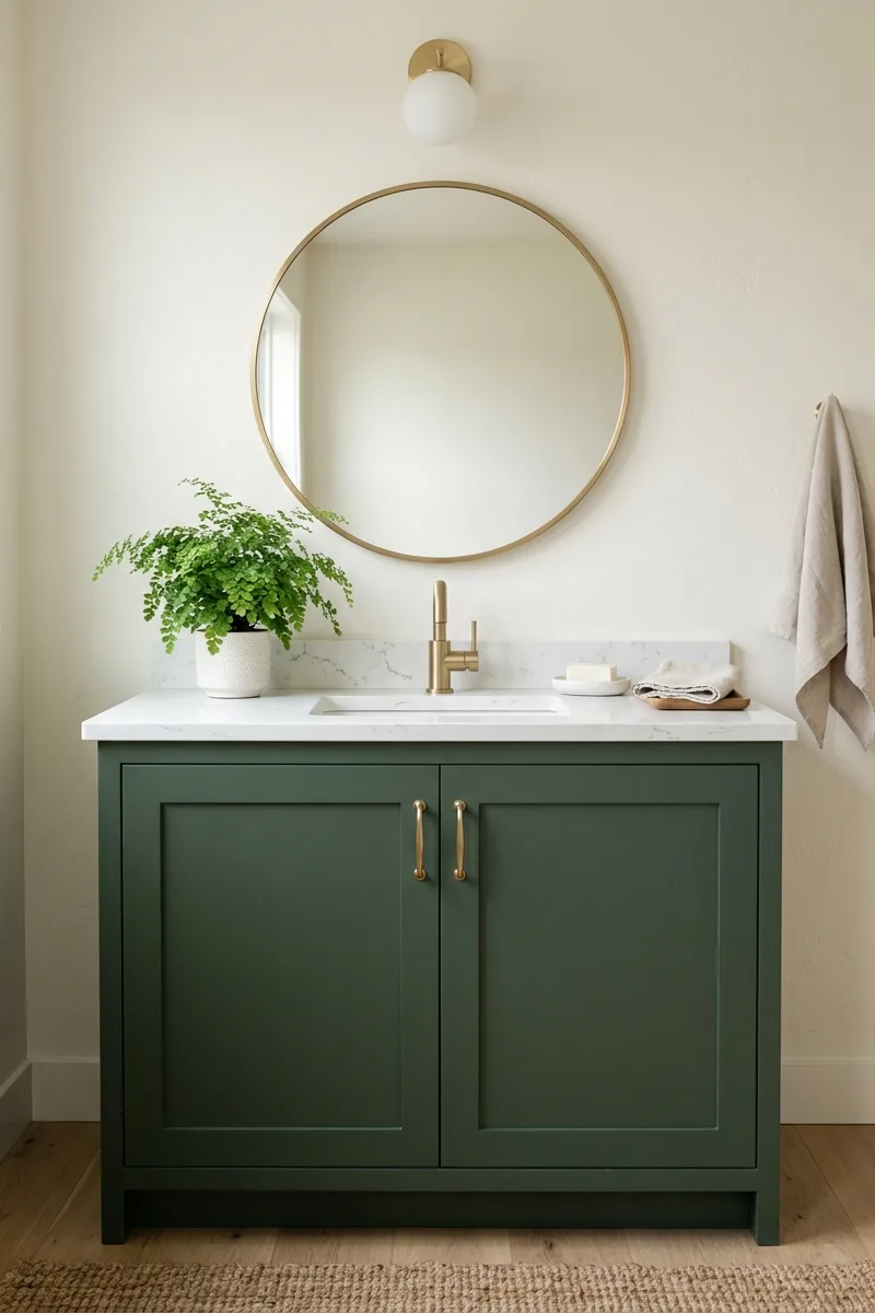
Fern is a deep, cool green like shaded forest floor. Ivory is a rich, warm off-white. Use fern on a vanity or lower walls for a bold, grounding element. Ivory on upper walls and ceiling for contrast. Add brushed brass or gold fixtures for a touch of luxury. The palette is rich, sophisticated, and brings the feeling of a woodland glade indoors.
Oyster and putty
Oyster is a pale, cool gray with pink undertones. Putty is a warm, greenish gray. Use oyster on walls for a soft, luminous feel. Putty on floors for grounding. The two grays work together to create subtle depth. Add white fixtures and natural oak wood. The palette is sophisticated and serene, like a beach pebble after rain.
Chive and bone
Chive is a bright, yellow-green like fresh-cut herbs. Bone is a warm, slightly gray white. Use chive on a small accent wall or as a tile stripe for a pop of energy. Bone on surrounding surfaces to keep the room calm. Add black fixtures for definition. The palette is lively but not overwhelming, perfect for a powder room.
Molasses and chalk
Molasses is a dark, warm brown like rich syrup. Chalk white provides crisp contrast. Use molasses on a vanity or as a tile accent for drama. Chalk white on walls for brightness. Add brass or gold fixtures for a touch of warmth. The palette is bold and grounding, perfect for a large bathroom that can handle deep, earthy tones.