12 Serene Contemporary Gray Living Room with Abstract Art and Neutral Palette, Elegant Modern Calm
Introduction
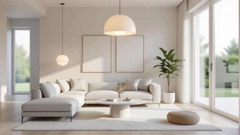
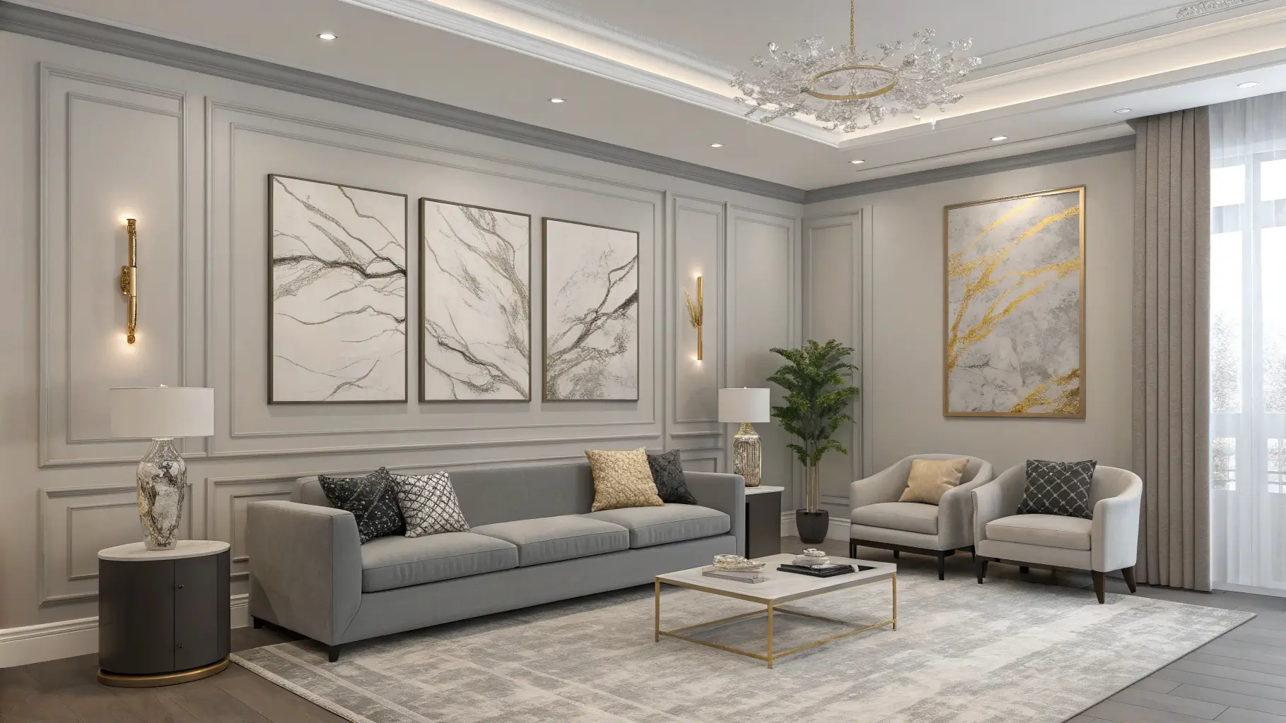
Gray can be restful, sophisticated, and warm when handled right. A Serene Contemporary Gray Living Room with Abstract Art and Neutral Palette uses muted tones, tactile fabrics, and one oversized artwork to create a collected, elegant feel. Across many client projects I have seen how a gray palette, balanced with wood and soft textiles, can read as both modern and cozy. This article gives 12 thoughtfully practical styling ideas, measurements, and sensory notes so you can let gray breathe and make the room feel loved, not clinical.
1. Start with a Warm Gray Base, Not Cool Stone
Choose a warm gray for walls or a sofa that has brown or beige undertones, so the room reads comforting in morning light. I often recommend sample swatches on different walls and view them at sunrise and late afternoon, since gray shifts with light. Actionable tip, pair warm gray with light wood and warm metals to add depth and a subtle glow.
2. Use One Large Abstract Artwork as the Anchor
A large abstract canvas in subdued tones organizes the room and gives the eye a destination. Hang it low above the sofa, leaving 15 to 20 centimeters between the frame bottom and the top of the sofa for good proportion. I once unified a gray living room by replacing several small prints with one wide canvas, and the space immediately felt calmer and more curated. Actionable tip, keep surrounding decor minimal to let the art breathe.
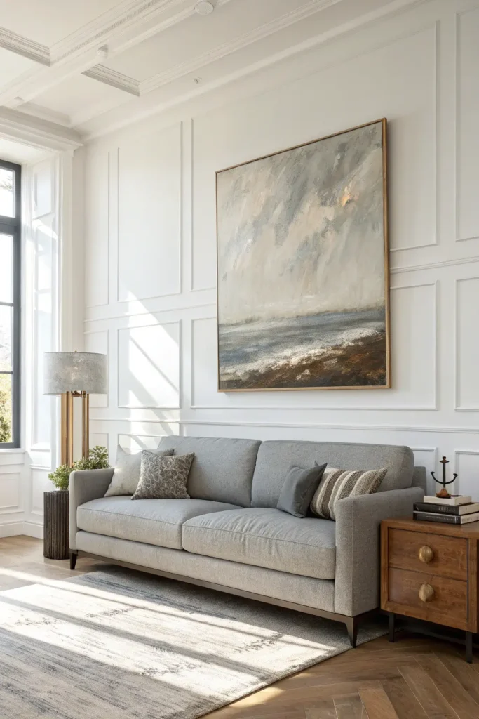
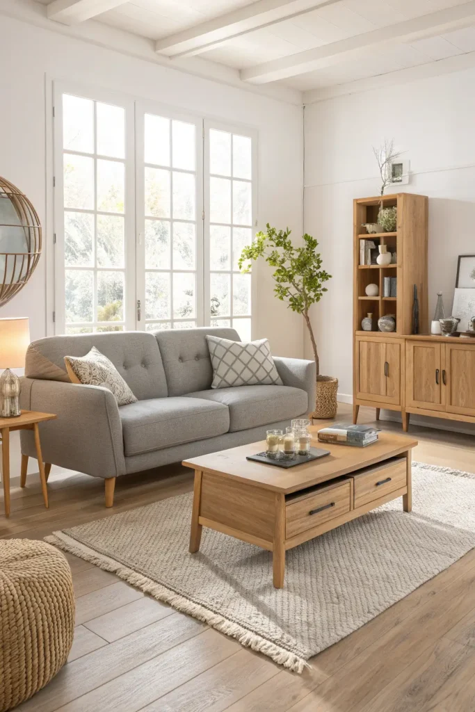
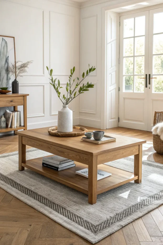
3. Balance Gray with Light Wood for Warmth
Introduce oak or ash furniture to counterbalance coolness and bring tactile grain into the palette. A light wood coffee table or media console introduces an organic note that softens gray surfaces. In multiple renovations I’ve done, swapping metal legs for wood on a table transformed the overall warmth. Actionable tip, keep one dominant wood tone and repeat it in two or three places for cohesion.
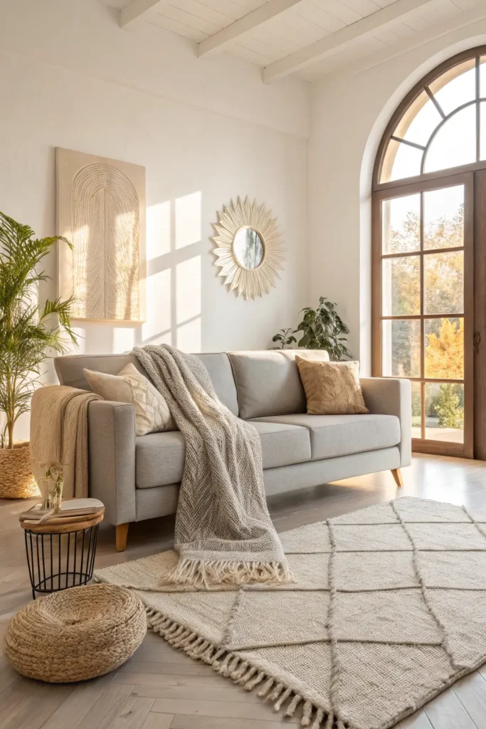
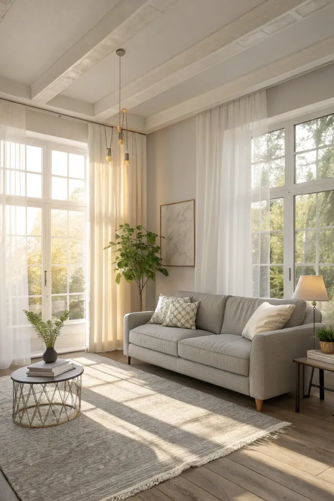
4. Layer Muted Textures to Keep Gray Inviting
Add boucle cushions, a soft wool throw, and a low-pile rug in warm neutrals so the gray feels tactile and inviting. I advise clients to use at least three materials with different weaves to create depth without color. Actionable tip, introduce a looped or low-pile rug to soften footsteps and visually warm the floor plane.
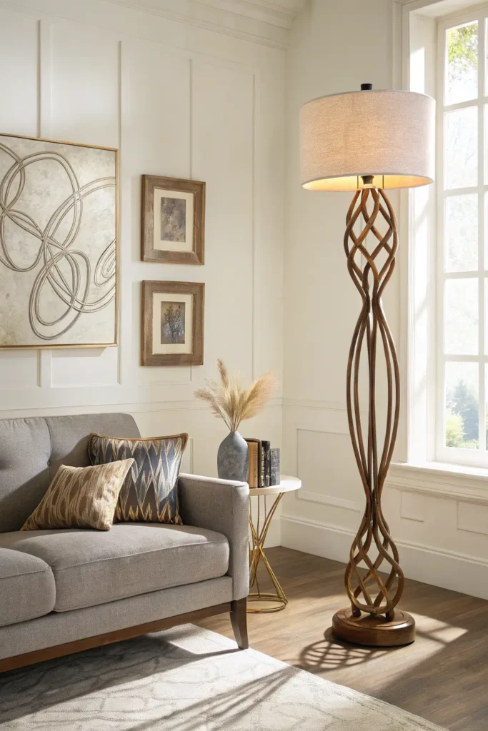
5. Add Sculptural Lighting to Complement Abstract Art
Choose a sculptural floor lamp or wall sconce to echo the lines in abstract art, creating a visual conversation across the room. In projects I’ve completed, pairing an organic lamp silhouette with abstract canvas produced a curated gallery-like feeling. Actionable tip, keep lighting finishes matte and warm to avoid cold reflections on gray paint.
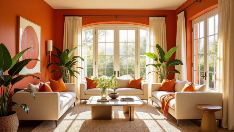
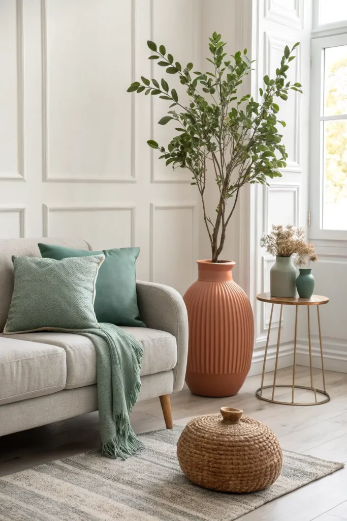
6. Use Subtle Color Pops with Muted Greens or Terracotta
Introduce small accents in muted green or terracotta, like a ceramic vase or cushion, to liven gray without breaking its calm. I recommend only two accent tones to keep the look cohesive. Actionable tip, repeat the accent color in three places to create visual balance, for instance, a vase, a pillow, and a small plant pot.
7. Keep Windows Light, Use Sheers for Soft Diffusion
Sheer curtains diffuse harsh sunlight and let gray read warmer and softer. When I staged a penthouse with concrete views, adding pale sheers softened the light and made gray upholstery feel less stark. Actionable tip, hang curtains close to the ceiling to maximize perceived height and drag them slightly on the floor for a tailored, intentional look.
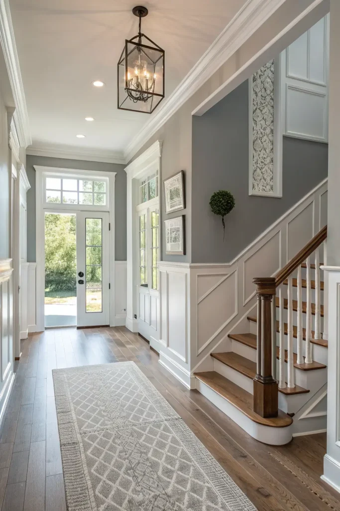
8. Opt for Low-Contrast Trim and Molding to Preserve Calm
Paint trim and moldings a soft gray slightly darker or lighter than walls to avoid sharp lines that break the serenity. In older homes I refreshed, dialing trim down to a close tone unified rooms and gave the space a more modern edge. Actionable tip, sample paint with large swatches to study how trim reads at different times of day.
9. Anchor the Space with a Centerpiece Coffee Table, Keep It Simple
A low wood or stone coffee table anchors seating and provides a surface for a small vignette. Keep styling minimal, with one tray, one vase, and one book. When I replaced a glossy table with a warm oak top in a client room, the whole scheme felt more intentional and usable. Actionable tip, choose a table proportionate to sofa length, roughly two-thirds the width of the seating.
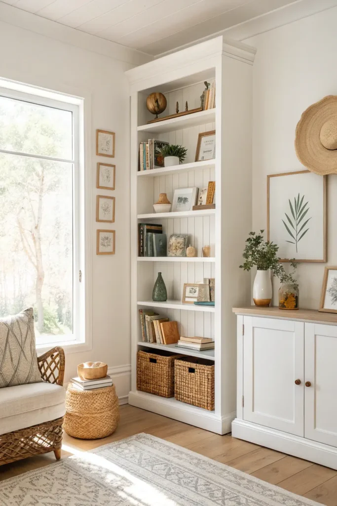
10. Use Built-In Shelving to Display Artful Books and Objects
Built-ins painted in a soft neutral present books and objects as curated still lives. I often recommend clients choose shelves with adjustable heights to accommodate different objects and rotate displays seasonally. Actionable tip, use odd numbers of items in vignettes and leave some negative space so shelves feel edited rather than crowded.
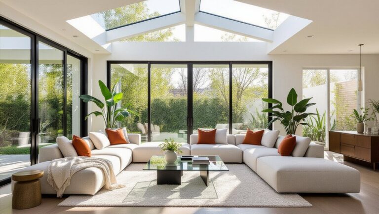
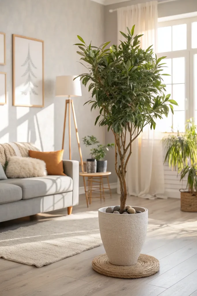
11. Anchor Corners with Sculptural Plants for Height and Movement
Tall plants in ceramic planters bring life and soft motion to corners, especially if placed near a window for leaf shimmer. In apartments I staged, a single tall plant improved perceived vertical space and gave a sense of calm motion. Actionable tip, choose plants suited to your light, and rotate them so growth is even and healthy.
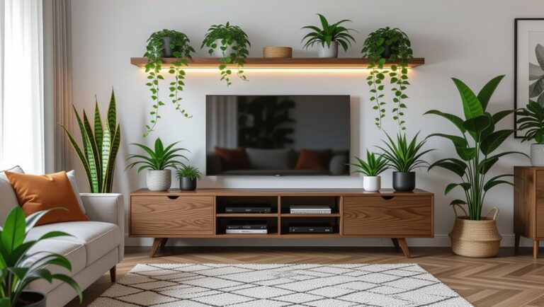
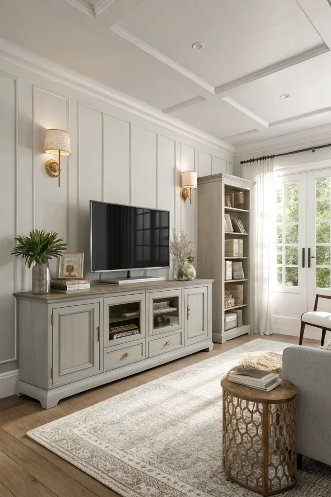
12. Keep Technology Out of Sight to Preserve the Mood
Hide cables and screens when possible with low consoles, storage baskets, or by mounting the TV behind sliding art panels. I advise clients to create a tech zone separate from seating when they want a restful, conversational space. Actionable tip, use a slim media console with cord-management and closeable storage to maintain surfaces that feel calm to the eye and pleasant to touch.
Common Mistakes to Avoid
- Using cool, blue-gray shades in low light, opt for warm gray samples.
- Overloading shelves with small objects, leave breathing room.
- Mixing multiple metal finishes, keep one warm metal.
- Hanging art too high, align centers around 145 centimeters.
- Ignoring curtain heights, hang close to ceiling for perceived height.
Recommended Decor Items
- Warm gray sofa or paint, light oak coffee table, large muted abstract canvas, boucle cushions, wool throw, low-pile rug, sheer curtains, sculptural floor lamp, ceramic planters, matte metal accents.
FAQs
- How high should large abstract art hang above the sofa?
Leave 15 to 20 centimeters between the bottom of the frame and the sofa back for balanced proportion. - What plant suits low light corners in a gray room?
ZZ plant or snake plant tolerate lower light while adding sculptural shape. - Should trim be white in a gray room?
No, low-contrast trim in a close tone to walls preserves calm and modernity. - How many accent colors work with gray?
Two subtle accents, repeated in three places, is a good rule. - Best rug choice for a gray living room?
A warm-toned low-pile wool or looped rug anchors the space without heavy texture.
Conclusion
A Serene Contemporary Gray Living Room with Abstract Art and Neutral Palette is a practice in restraint: pick warm gray, layer tactile materials, and let one oversized artwork do the talking. Try one measured update this weekend, like hanging a large print or adding a boucle cushion, and notice how gray can become comforting, elegant, and utterly serene.